Calligraffiti

wings_mural_small

I have just been enlightened to the work of Niels Shoe Meulman. A street artist, designer and calligrapher out of Amsterdam. I discovered his work while researching Krink paint markers for upcoming live art events. Shoe, as he is called, started tagging in the early 80’s and has gained gallery notoriety be melding the grit and aggression of graffiti with the beauty and elegance of calligraphy. I am not one for words, so here is an excerpt from his site.

WHAT IS CALLIGRAFFITI?

The simple answer:

Calligraffiti is a combination of Calligraphy and Graffiti.

Calligraphy is about the art of writing and can have many forms. Whether it be Japanese ancient brush characters, Arabic pictorial scripts, illuminated mediaeval books or swirly quill writing… all calligraphy.

Graffiti is the art of getting your (pseudo) name up by writing on an urban environment. Perfected in New York City and now a worldwide phenomenon.

The fairly new art of Graffiti and its somewhat rigid rules prompts us to look further back into the history of writing. This is exactly what Niels Shoe Meulman has been doing since his teens, consequently starting to combine the two at the beginning of this century. Thus resulting in Calligraffiti: traditional handstyles with a metropolitan attitude.

Here is a selection of images from his Calligraffiti site, but you should really go on there yourself and check it out:

cosmopolis

wall_hard2

calligraffiti_booklet

Return on Design

This is an article that was forwarded to me by one of my clients. The article was written by Seth Godin a marketing guru of sorts who writes all sorts of books and blogs centered around marketing and whatnot. I am not sure what she is trying to hint at but it is interesting information. Hopefully she considers me to fall under a positive return and isn’t passively-aggressively telling me to get my shit together! How do your clients think of you? Do they consider you a waste of money? Take a glance at the article and give it a think. In these had economic time you are really going to have to sell yourself and your talents to wrangle up some clients.

Return on Design

by Seth Godin

Return on investment is easy to measure. You put money in, you measure money out, divide and prosper.

But return on design? (Design: graphics, system engineering, user interface etc.)

Design can take money and time and guts, and what do you get in return? It turns out that the sort of return you’re getting (and hoping for) will drive the decisions you make about design.

I think there are four zones of return that are interesting to think about. I find it’s more useful to look at them as distinct states as opposed to a graduated line, because it’s easy to spend a lot of time and money on design but not move up in benefits the way you might expect. Crest might have a better package than Colgate (or the other way around, I can’t remember), but it doesn’t sell any more units…

Negative return. The local store with the boarded up window, the drooping sign and the peeling paint is watching their business suffer because they have a design that actually hurts them. Software products suffer from this ailment often. If the design actively gets in the way of the story you tell or the utility you deliver, you lose money and share.

No impact. Most design falls into this category. While aesthetically important, design in this case is just a matter of taste, not measurable revenue. You might not like the way the liquor store looks, or the label on that bottle of wine, but it’s not having any effect on sales. It’s good enough.

Positive return.
We’re seeing a dramatic increase in this category. Everything from a bag of potato chips to an online web service can generate incremental sales and better utility as a result of smart design.

The whole thing.
There are a few products where smart design is the product (or at least the product’s reason for being). If you’re not in love with the design of a Porsche 911, you would never consider buying it–same as an OXO peeler.  The challenge of building your product around breakthrough design is that the design has to in fact be a breakthrough. And that means spending far more time or money than your competitors who are merely seeking a positive return.

Knowing where you stand and where you’re headed is critical. If you have a negative return on design, go ahead and spend enough money to get neutral, asap. But don’t spend so much that you’re overinvesting just to get to neutral. Watching a local store build an expensive but not stellar custom building is the perfect example of this mismatch.

If you’re betting the whole thing, building your service launch on design first, skimping on design is plain foolish.The Guggenheim in Bilbao would be empty if they’d merely hired a very good architect.

Josh Ryan, my friend

I see that many people have been searching the blog for information on the sad story of Josh Ryan. Here is what I have for you:

A few weeks back I posted an excited rant on the new screen printing business my friends and I were working on. Josh Ryan, the guy who brought us all together to get excited about the project ended his life last week, Tuesday the 24th of February. Josh was one of the nicest, most out going and personable people I have ever had the pleasure of calling friend. We met in high school and got to know each other on the wrestling team. We were the same weight so we had to wrestle off for the varsity position every week.  We lost connection (like I did with most people) when we parted ways for college. We reunited when we both moved back to Tuolumne County. He would always ask me about graphic design and screen printing and propose the idea of working together. It wasn’t until recently that we really started working together and setting up the business plan with our partners. We had met with potential clients, attended community meetings and signed up for volunteer work together. He was always talking about the future and setting up plans for us and the print shop. The last day I saw him I had brought him to the print shop I use for my relief printing. He was really excited to learn the craft and start a new painting. We made plans to meet the next day to work on a project together. The next day came and I couldn’t get a hold of him. I didn’t think much of it because Josh didn’t have a working cell phone. Later that night Calen called me and told me of the news. I was in a state of disbelief and denial for the rest of the week. It is still hard to believe that my friend, someone whom I had been working so closely with, could be feeling how he did without ever showing the slightest hint of depression, distress or angst. Know that nothing is so bad that you need to end your life. Attend his memorial and you will see the hundreds of people loved Josh and would have done everything in their power to keep him here with us today.

A memorial will be held in Josh’s honor this Sunday, March 8th at 1:30pm at the Sierra Bible Church.

UTL v. Monterey

monterey_collage

I spent the last weekend having a great time in Monterey, CA for my girlfriend’s 25th. Monterey is a great place to visit (tourist trap) with plenty of period typography and hand painted signs. Take a peek:

sardines_hovden

perfet_squid2

{vintage seafood packaging greets you as you enter the aquarium}

theatre1

{I noticed this driving through downtown Monterey}

parking

{showin’ ya the finger}

Forest Stearns & LURV!

Come check out some sweet images from home-town-artist turned bay-area-bad-ass Forest Stearns and get your dance on to DJ and electronic sets by NISIS, LURV & DJ ILL TONES. I know I will be there.

artshow

Artist Survey #15: Danae Wilson

I met Danae on my second day at CSU Long Beach. We lived in the same dorm building and along with her roommate Christina and my neighbor Mike became good friends. She has a talent to control whatever medium she works with incredible ease. At least it looks that way to me…I can’t paint fer crap!
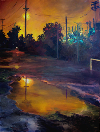
{Oil on Canvas}


{Oil on Canvas}
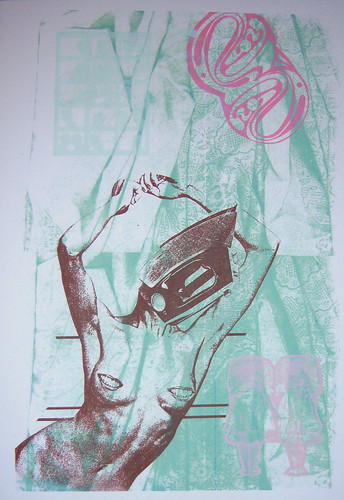

{Screen Print}


{Oil on Canvas}

Name: Danae Wilson

Location: Long Beach, CA

Medium(s): Drawing and Painting- Charcoal and Oil on Canvas mostly but I do pattern making and screen-printing, as well as ceramics and metal work.

What do you consider yourself (artist/designer/other)? I am an artist, but I play around with interior and graphic design.

Where can we see your work (place/publications/url)? My flickr but it needs to be updated there’s not much there.

When did you start gaining interest in artistic forms of expression? I started drawing when I was 2. My dad was a Pastor of a church and my mom worked so I stayed with him during the days. I would sit on the floor drawing and painting for hours. I was five when I told my mom I would try and think of something I wanted to paint before I went to bed so that I could dream about and have more to paint about.

Who/What inspired your interest? I used to take lessons as a child and I would go to The San Diego Museum of Art. My favorite painting as a child was Jaques-Louis David’s Death of Marat. I also loved the impressionists and the idea that I could invent anything I wanted on paper. My other inspiration was Harold and the Purple Crayon, I loved that he invented a world around him using only his purple crayon and some imagination.

What is your day job? I am a Photo Retoucher. I use Photoshop to enhance wall portraits (removing blemishes, wrinkles, extra pounds, and unwanted people in backgrounds).

Why do you create? I create because I have to. I don’t create enough though and this plagues me.

Is there any recurring theme in your work? The idea of dystopia comes up a lot in my work, which I think stems from coming to Los Angeles and my feelings of disenchantment and disgust, mixed with wonder. I also focus on personal themes, roles of women, and often my work is inspired by classic literature. I am also a Comparative World Literature minor.

What do you want from your work? I want my work to inspire and receive respect from those who I admire and respect within my art community, but I also want my work to stay universal and retain the ability to communicate to those who are not part of the “art world” and have no training in art history and the art canon.

What do you want viewers to take from your work? I like people to be able to project their own feelings and emotions onto my work. When I create something that is open ended enough that someone else can come and put his or her own interpretation into the piece, then I’m happy.

How often do you work on personal projects? Pretty often. My figurative works are what I consider my “personal projects,” although I have been showing them at school lately so they are less personal.

How often do you work on commissions or commercial work? I do paintings for charities although I never show this work to anyone else because of how commercial and even kitschy the works can be.

Does your art support you financially? No. However I do find photo retouching to be a distant cousin of painting and its close enough since it pays the bills.

Do you feel preoccupied with your art, do you think about it often during the day and night and do you anticipate your next session? Yes. I think of all sorts of projects and paintings that never come into existence because of factors like time, money, and freedom to explore without feeling like the work is “unworthy.” I need to let go of those restrictions though.

What do you do in your spare time besides your art? I go camping, I love nature, I love being away from the city. I ride my bike on the beach a lot. These things make me so happy. When I can, I travel. I push myself to grow whenever I can and I pursue things that make me uncomfortable. I never want to be at rest.

Which musicians are you currently interested in? Bon Iver, Fatboy Slim, Sigur Ros, and always Classic Rock

Are there any events you are looking forward to attending? COACHELLA!!!!!!!!!!!!!!!!!!

How long do you generally take on a piece? A week. I have NO patience. I’m a “one-shot” painter and I don’t usually go back to old pieces.

Have you jeopardized or risked the loss of a significant relationship, job, educational or career opportunity because of your art? Over and Over. Artists can only date very patient and understanding people who see that art is a necessity and who want to promote your growth rather than monopolize your time.  I could have done anything coming out of High School, but I chose the art path and I know that I will probably never see a ladder that I can climb or any obvious ways to advance myself. Artists have to be as creative with their career and employment as they are with their art.

Do you work on multiple projects at once? Yes. I work on abstracted apocalyptic landscapes, as well as large-scale figurative drawings.

Do you have trouble parting with your finished work? I never part with my work, at least not anything I really cared for. I know it will be hard when I do but so far I have hoarded most of my work or given it to my mother and father.

Great News Everybody!

In spite of the recent economy I have been invited to become a founding member of a new, youthful, energetic, kick ass screen printing shop with my two friends Josh Ryan and Calen Davidson. We have resolved to destroy our competition by concentrating on the artwork that goes into each piece we create, weather it be a t-shirt, sticker or poster. Most of the graphic design and illustration applied by other screen printers consist of run-of-the-mill clip art that can be selected by anyone out of a book. The results are boring, lifeless and dated images that have been over applied by the world over. We promise to create unique, original art for each and every customer because that is what the world needs, not more clip art.

Company president, Josh Ryan, is a fantastic fine artist/illustrator who has been honing his talents for over a decade. Zac Calbert, our art director, received his degree in Studio Art with an emphasis in graphic design and visual communication from California State University Long Beach in 2006. He has been hired on several occasions to create the art for multiple print shops and small businesses in the county. Both Calbert and Ryan have been dabbling in printmaking for several years. Calen Davidson majored in marketing at Chico State and has been a recreational cartoonist for well over a decade. He has the business knowledge and selling power to acquire large accounts throughout the region.

The point to all of this being that these three individuals have a passion for the art behind the trade and seek to better the appearance of their community while upholding the tradition of printmaking. Our competitors can only offer a barely acceptable solution to the small business needs of our extended community. Hopefully we will be elbow deep in business by the end of the year.

{Stay tuned for information on our SECRET WEAPON}

Death in Le Style Mucha

Many people would argue that Alphonse Mucha is one of the most definitive artists of the art nouveau movement. Mucha was a Czech artist whose work for the Paris theatre gained him world wide notoriety. His bold yet beautiful illustration style held great influence over much of the art created in the early 1900s. His stylized floral patterns and intricate border elements are imitated by illustrators, printmakers & designers to this day. Although I didn’t know much of the artist until recently I have been a fan of his heavy outlined figures, bold color fills and ornate organic imagery. Take a peek at these images I found online:

Being a admirer of Mucha’s and modern day metal head I could not help but take great notice in the work of John Dyer Baizley. Baizley is an artist who’s work can be found on many of today’s prominent hardcore, grindcore and heavy metal albums including those of his own band Baroness. I bought a Pig Destroyer album on sight alone because of his work. To view his work is to gaze into beautiful death. It is as though Baizley has taken the essence of Mucha’s illustrations and threw them in a blender with the decaying corpses of prom queens. The similarities are obvious, but the differences are startling. Baizley does a fantastic job a nodding to Mucha while creating his own dark path to travel down. If you can’t quite imagine it take a look at these:

Calligraphic Scrolls

Sorry I haven’t been posting much lately I have been slacking. Here are some cool scrolls I found in a clip art book. It goes to show that the artists of olde were well versed. Not only could these chaps write beautifully, but they could illustrate inventively.

scroll1

scroll2

scroll3