Poster Art(Chantry)

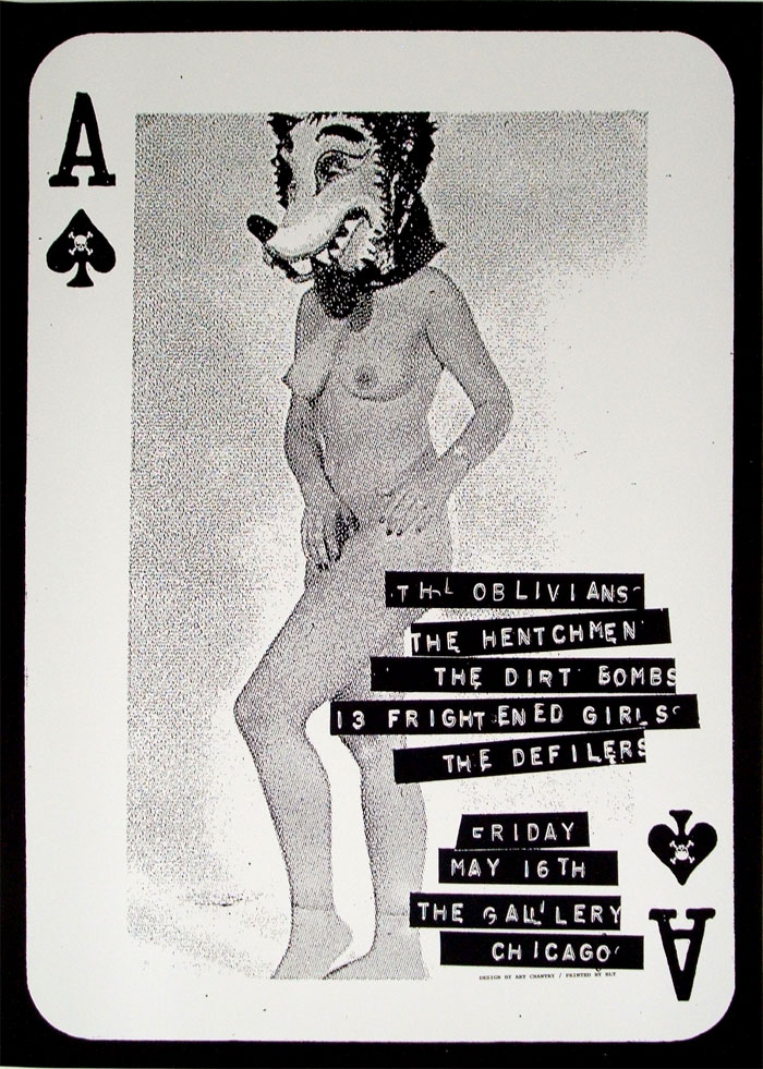
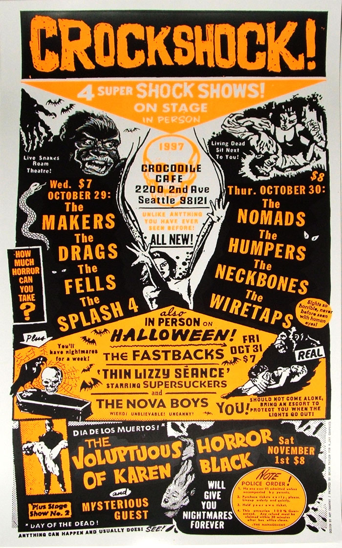
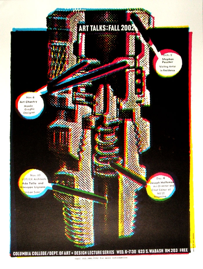
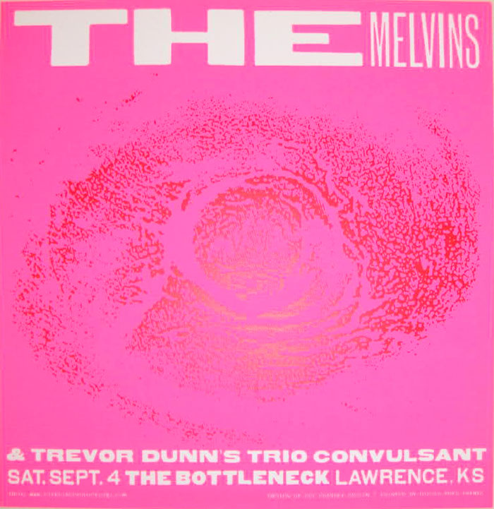
I started following Art Chanrty’s Facebook feed some time ago. He fills his posts with insights on pieces of design and ephemera that span the century. From napkin prints to automotive typography, Chantry’s no-nonsense posts are great reads when you need to kill some time and great inspiration when you are in a slump. He is the only person that I “know” who has topped out his Facebook Friend quote of 5000! He is that interesting.

I received my first formal education on Chantry’s work in Tim Musso’s design class back at CSULB and have been a fan ever since. He built his reputation in the 80s and 90s by practicing a low-tech, “DIY” approach to design. While other designers were striving for perfection, Chantry was capitalizing on imperfection. By pulling images and text from their original publications and collaging them together, he created bold, eye-catching work (of course the florescent inks don’t hurt either) that defined the Seattle music scene. Chantry is one of the most influential names in the rock poster/packaging biz. In short Chantry is the master of cut-n-paste design.

The other day (several months ago now) he announced that he needed to sell some stuff and, naturally, I responded that I wanted to buy some stuff. I sent him a message stating that I am into “grunge, metal, monsters, dinosaurs & screen printing” and we hammered out a deal: I will send him money and he will send me prints. A week later I had several incredible, hand selected posters from the artist himself.

The poster choice alone goes to show what type of designer/person Mr. Chantry is. I asked for monsters and I got monsters. I am sure that he has stacks of posters from the years and he went through and grabbed ones he thought would fit my fancy… and boy did they! According to Wikipedia: “[Art Chantry’s] work has been exhibited at the Rock and Roll Hall of Fame Museum of Modern Art, Seattle Art Museum, the Smithsonian and the Louvre” and now my house!

Look him up when you get the chance. You won’t regret it.


Business 101: Get Paid First [CENSORED]

If you are looking for the original posting of this it has been removed. The business operator asked me to take the business name off of the post. This is a censored version.

I don’t know about you, but I hate the business aspect about being an independent designer. Writing invoices, bill collection, contracts and the like are not my specialty. Sometimes, hell most of the time, I get so excited about starting on a new job for a client that I neglect to go through the motions and secure a deposit. The fact that 70% of potential clients need a rush doesn’t help either. They are usually in such a frenzy that I try to get them what they need as soon as possible. Living in a small town and getting paid is not usually an issue. Every once in a while you will deal with some asshole that screens his phone calls and drops off the face of the earth, but not usually. If only I had listened to the words of wisdom from my screen printing mentor the following story might have not happened:

“An error on your account doesn’t constitute an emergency on mine.”

Last summer I was contacted about creating a logo and printing it on some shirts for the reopening of [CENSORED]. [CENSORED] said that they were in a big hurry to get things done and needed a rush turnaround on the shirts. I met up with him as soon as possible with a product catalog gave him prices and shirt options and then discussed the logo they needed. I went home that night excited about gaining a client that I knew would  be around for a long time and would need a lot of work as they are planing on franchising. I started working on a logo immediately and sent him a low-res version of it to gauge his feelings on the direction I was going in so that I would waste time on something he hated.

He responded that he liked it, but not much else.

I figured that he was busy trying to get things ready for his opening and would of course ask for the shirts to be done in a day. So I called and sent him emails every other day to remind him that he needed to confirm on the number of shirts and the logo before I could continue with the job.

Eventually the restaurant opened and I was never contacted. I didn’t even know they were open until I drove by it one day and saw a crappy version of my logo staring back at me from the front door. I couldn’t believe it.

[CENSORED] had paid someone else to copy my intellectual property, which they did poorly, when he could have just paid me for the original. Why would someone do this? So far it is the first time this has happened to me and I intend to not let it happen again. So far they have lost a chimichanga loving customer, but I hope that they lose so much more.

You guys think I have a case?

2010 Projects

Happy New Year! I haven’t been posting a whole lot lately, but it isn’t because of lack of activity. In addition to normal client work I have been working on several art projects which are all in various stages of completion. Posted below are some of the skateboard paintings I have been working on. The decks were donated by Matt Alison of Flatspotz Skate & Car Club, in exchange I designed a shirt print for the club. The decks will be featured in an art show hosted by the arrows.andbones(COLLECTIVE) that will be opening hopefully by the end of the month. The fantastic band West of Next have also commissioned me to create some new posters and album art for their upcoming year. I have also been working on several sketches for a series of crypto-creature prints including the jackalope, krakken and the deer lady (sketches not pictured). I have also, like most people, been spending way too much time on Facebook. Become a fan of UTLTRN Design and stay up to date on art happenings in and around Tuolumne County.


{Hand painted skateboards}


{Flatspotz shirt design}

{West of Next gig flier}

UTL vs Local Entities

I have been creating some shirt images for local groups and events through West Side Design in the city of Tuolumne. Here are are some designs/illustrations that will be walking around in the coming months:

na
gs_mlru
{for Golden State Cellular}
tlj2009
{lumberjack character from previous artist}

Return on Design

This is an article that was forwarded to me by one of my clients. The article was written by Seth Godin a marketing guru of sorts who writes all sorts of books and blogs centered around marketing and whatnot. I am not sure what she is trying to hint at but it is interesting information. Hopefully she considers me to fall under a positive return and isn’t passively-aggressively telling me to get my shit together! How do your clients think of you? Do they consider you a waste of money? Take a glance at the article and give it a think. In these had economic time you are really going to have to sell yourself and your talents to wrangle up some clients.

Return on Design

by Seth Godin

Return on investment is easy to measure. You put money in, you measure money out, divide and prosper.

But return on design? (Design: graphics, system engineering, user interface etc.)

Design can take money and time and guts, and what do you get in return? It turns out that the sort of return you’re getting (and hoping for) will drive the decisions you make about design.

I think there are four zones of return that are interesting to think about. I find it’s more useful to look at them as distinct states as opposed to a graduated line, because it’s easy to spend a lot of time and money on design but not move up in benefits the way you might expect. Crest might have a better package than Colgate (or the other way around, I can’t remember), but it doesn’t sell any more units…

Negative return. The local store with the boarded up window, the drooping sign and the peeling paint is watching their business suffer because they have a design that actually hurts them. Software products suffer from this ailment often. If the design actively gets in the way of the story you tell or the utility you deliver, you lose money and share.

No impact. Most design falls into this category. While aesthetically important, design in this case is just a matter of taste, not measurable revenue. You might not like the way the liquor store looks, or the label on that bottle of wine, but it’s not having any effect on sales. It’s good enough.

Positive return.
We’re seeing a dramatic increase in this category. Everything from a bag of potato chips to an online web service can generate incremental sales and better utility as a result of smart design.

The whole thing.
There are a few products where smart design is the product (or at least the product’s reason for being). If you’re not in love with the design of a Porsche 911, you would never consider buying it–same as an OXO peeler.  The challenge of building your product around breakthrough design is that the design has to in fact be a breakthrough. And that means spending far more time or money than your competitors who are merely seeking a positive return.

Knowing where you stand and where you’re headed is critical. If you have a negative return on design, go ahead and spend enough money to get neutral, asap. But don’t spend so much that you’re overinvesting just to get to neutral. Watching a local store build an expensive but not stellar custom building is the perfect example of this mismatch.

If you’re betting the whole thing, building your service launch on design first, skimping on design is plain foolish.The Guggenheim in Bilbao would be empty if they’d merely hired a very good architect.

UTL v. Monterey

monterey_collage

I spent the last weekend having a great time in Monterey, CA for my girlfriend’s 25th. Monterey is a great place to visit (tourist trap) with plenty of period typography and hand painted signs. Take a peek:

sardines_hovden

perfet_squid2

{vintage seafood packaging greets you as you enter the aquarium}

theatre1

{I noticed this driving through downtown Monterey}

parking

{showin’ ya the finger}

Death in Le Style Mucha

Many people would argue that Alphonse Mucha is one of the most definitive artists of the art nouveau movement. Mucha was a Czech artist whose work for the Paris theatre gained him world wide notoriety. His bold yet beautiful illustration style held great influence over much of the art created in the early 1900s. His stylized floral patterns and intricate border elements are imitated by illustrators, printmakers & designers to this day. Although I didn’t know much of the artist until recently I have been a fan of his heavy outlined figures, bold color fills and ornate organic imagery. Take a peek at these images I found online:

Being a admirer of Mucha’s and modern day metal head I could not help but take great notice in the work of John Dyer Baizley. Baizley is an artist who’s work can be found on many of today’s prominent hardcore, grindcore and heavy metal albums including those of his own band Baroness. I bought a Pig Destroyer album on sight alone because of his work. To view his work is to gaze into beautiful death. It is as though Baizley has taken the essence of Mucha’s illustrations and threw them in a blender with the decaying corpses of prom queens. The similarities are obvious, but the differences are startling. Baizley does a fantastic job a nodding to Mucha while creating his own dark path to travel down. If you can’t quite imagine it take a look at these:

UTL vs. Fake Event Posters

Here are some posters I made for my portfolio near the end of my time at CSU Long Beach. They were created on my own time when I was trying to fill my portfolio with work that was less clean and more edgy than what I was making in class.

atvc

(Paul R. Brown does a lot of great packaging for the
hard rock/heavy metal industry. Particularly Marilyn Manson.)

blues

(An annual event held at the CSULB campus)